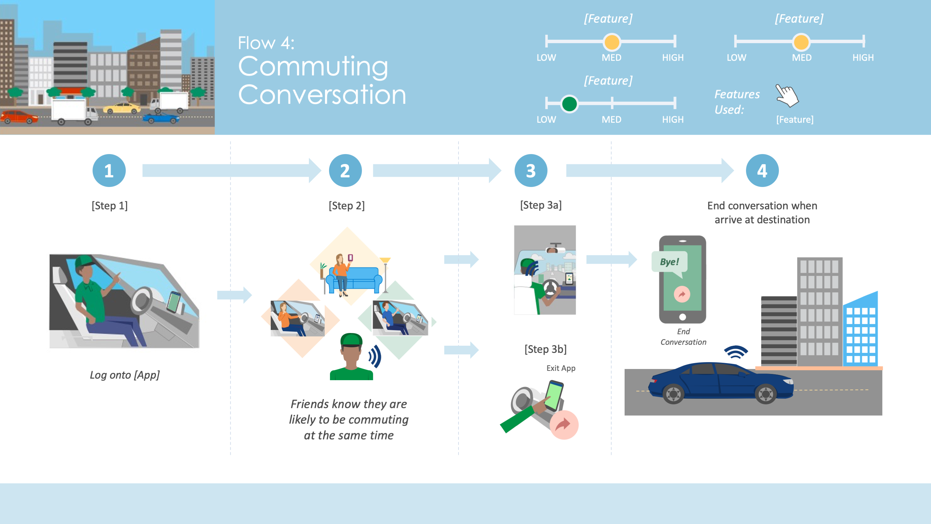
5 Lessons Learned from Voice Design Experts
This month, AnswerLab hosted five leaders driving the conversation around voice at our San Francisco office to share the...
Delivering UX research insights in a clear, impactful, and engaging way can be a difficult task. No one wants to read pages and pages of text or sift through an outdated PowerPoint deck to get to the findings. As UX Researchers, we’re always asking ourselves how we can deliver findings in ways that are clear and useful so our stakeholders get the information they need to take action. Effective reporting can be the difference between walking away without a roadmap for next steps and creating team and business growth. Design and visualization can help.
Design is a storytelling process. It can make findings easy to digest. It shows, rather than tells, stakeholders where to focus their efforts next, surfaces the little details of research, and offers unique viewpoints on findings. Used correctly, design can help your findings live on within your organization. Often a plain text document is not the right approach to sharing research findings. But, using visuals in your reports is about more than just making things look good. Don’t use design just for the sake of design. Use it to help communicate your message more effectively and brings your findings to life.
At AnswerLab, our Design Team is made up of design experts with backgrounds in advertising, UX, and graphic design who specialize in visual storytelling for research. They partner with our researchers to create invaluable visual deliverables that tell the story of our research findings, helping our clients make better and faster decisions through data visualization, charts, experience maps, personas, and more.
We asked Lisa Vissichelli, our Head of Visual Design, to talk us through a couple tips to help researchers incorporate design in their reports, even if they don’t have a designer on their team. From using metaphors and stories to selecting the right graphics, we hope you’ll find these useful.
As always, your methods for making the most impact depend on who you’re presenting to. How do your stakeholders typically respond to your reporting style? What makes the biggest impact for them? Pay attention to how your stakeholders react to your reporting techniques and make adjustments as needed, especially as you experiment with methods we outline below. Curating your reporting style is a process that happens over time, so be willing to ask for feedback and refine as you go.
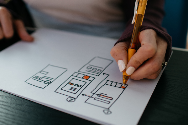
Sometimes text alone can’t fully explain the experience your users are having or the ways to improve it. For example, you might be looking to understand how the participant is touching or holding the device, what environment they’re in when interacting with your product, or how they’re interacting with it. Consider the concept of a manual or picture book and use your design elements to demonstrate these interactions in ways a simple screenshot or text summary may be unable to do.
To turn your findings into an instruction manual for your stakeholders, use diagrams, mock-ups, icons, or charts as different ways of looking at the same text-only information. In this example, a simple visual shows participants’ preferences on accessing information with tabs versus separate windows on desktop. Showing these options in an illustration clearly differentiates the preferences at first glance and helps readers visualize the changes.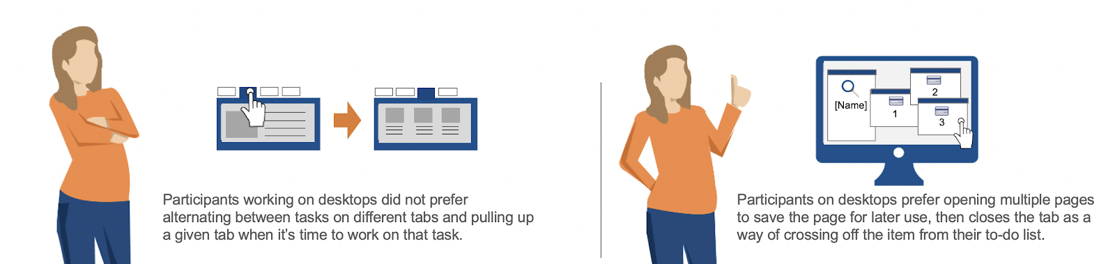
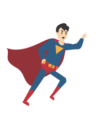 Using metaphors can make findings more relatable and often helps stakeholders take a step back from the details of their product or brand. For example, when conducting competitive analysis, you might use a metaphor or story to help stakeholders understand their place within the market in a different way. During sessions, you’ll likely uncover the strengths and weaknesses of your brand and your competitors during your sessions. Review the findings to pick out the comparison points, then brainstorm creative ways to make those comparison points come to life.
For example, customers might see your brand as the “Superman” of the market, but what are the other “superheroes” that exist alongside you? What are their strengths and weaknesses? Or, let’s say you and your competitors are all neighbors on the same block. What is your brand’s “lifestyle” in comparison to your neighbors? Characterizing your competitors as fellow superheroes or neighbors (and using illustration or icons to visualize them) helps take stakeholders out of their typical product-focused environment and begin thinking about the findings in a different light.
An experience map is the visualization of a user’s experience as they go through a series of steps to complete their goal or journey. Experience maps are helpful to understanding your customer’s story from start to finish and looking for opportunities for improvement along the way. It could take the form of a “day in the life” or show the user’s “onboarding journey,” for example. It not only asks where the journey begins and ends, but every step in between. They can answer questions like, Where does the experience begin, what’s in their environment, what are they interacting with, where does it end? In both of the following examples, graphics and illustrations help show environments, emotions, actions, and obstacles as the user is interacting with the product. It allows the reader to easily see the differences and put themselves in the user’s shoes.
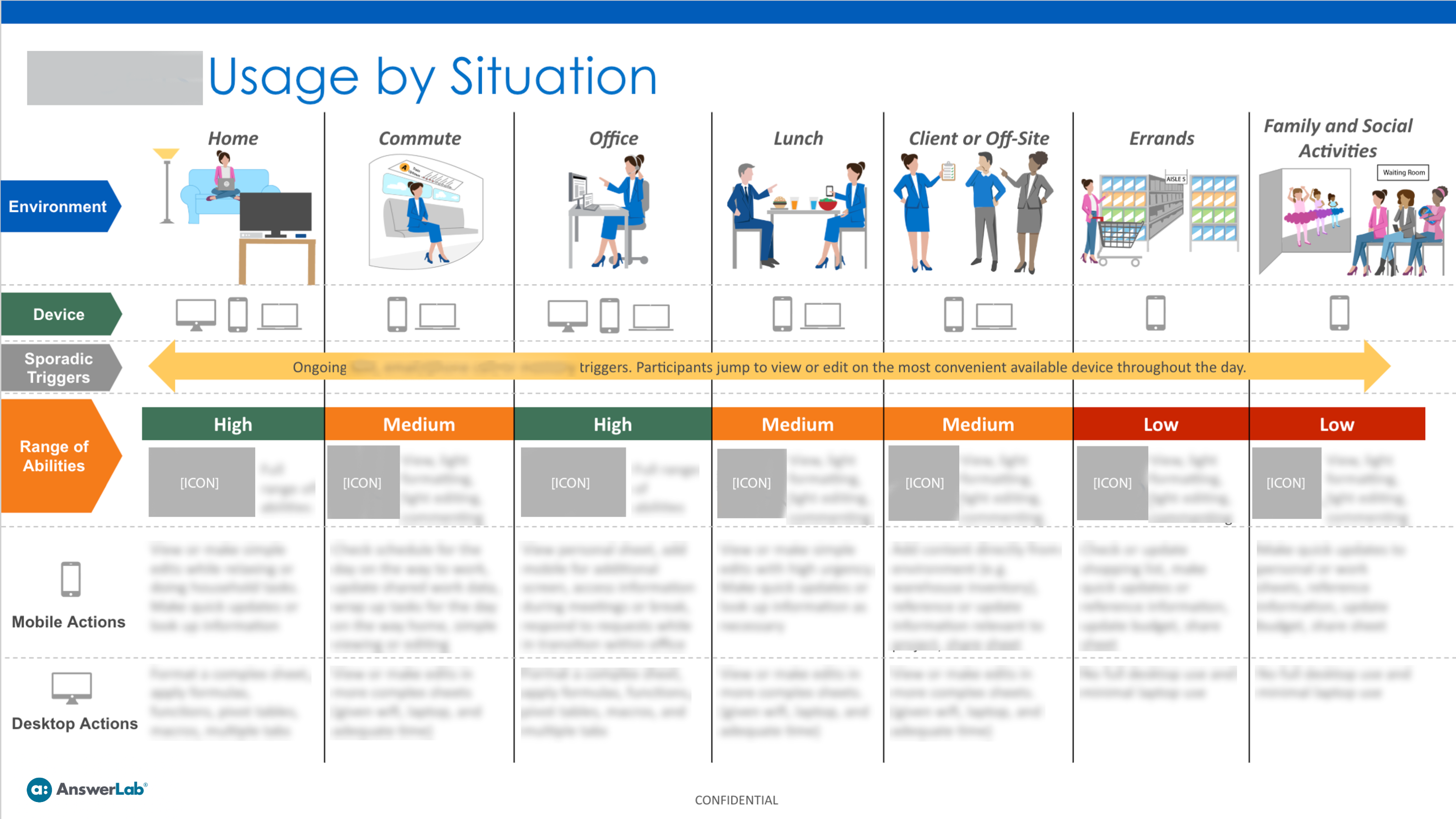
Experience maps give us the opportunity to not only follow the basic path of getting from point A to point B, but also explore the pivot points and factors that influence the process as a whole. We often see journey maps that are linear or point in time, but there’s a lot you can do to visualize key spots along the way where a path might diverge or shift. Use icons or graphics to show distinct pivot points, calling attention to moments of potential interaction or improvement.
 Personas are the archetypal customers that represent the mindset and wants of a large group of users. They help you differentiate your customer segments and understand motivations, wants, and circumstances to better strategize how to meet their needs. In creating personas, it’s important to include all of these motivations and influences, so you don’t get stuck on the demographic details. Design can help make this even more feasible.
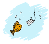

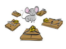
When visually representing personas with illustration, sketches, or diagrams, it helps stakeholders see customer segments as more complete and holistic beings. Focus on who the person is and use metaphors and design to help communicate that so you don’t get stuck on the outward appearance or demographics. In these visual examples, we used illustrations of a fish going for a reward on a hook, a mouse surrounded by traps, or an octopus multitasking to more closely link the mentality of the customer to the persona image. Using imagery like this can give a more holistic representation and make your customer segments more relatable.
People are visual beings, so seeing ideas and findings laid out visually can make a big difference in communicating impactful insights. If you’re looking to step up your visualization game, check out Information is Beautiful or Flowing Data for some inspiration. Or, take a look at Blush or Noun Project to get started adding some design to your reports.
Questions about the role of our Design Team in our research process? Contact us!